Hilton Hiroshima is the first Hilton in the Chugoku – Shikoku region. To represent the Setoguchi area, “a world of islands and sea,” local artists, traditional crafts, and colors that vary from place to place come together to convey the charm of the Setouchi to our guests. Here is an insight into the design work behind the production and installation of large-scale works: the three-dimensional relief of the entrance, the chapel screen, and the restaurant ceiling art.
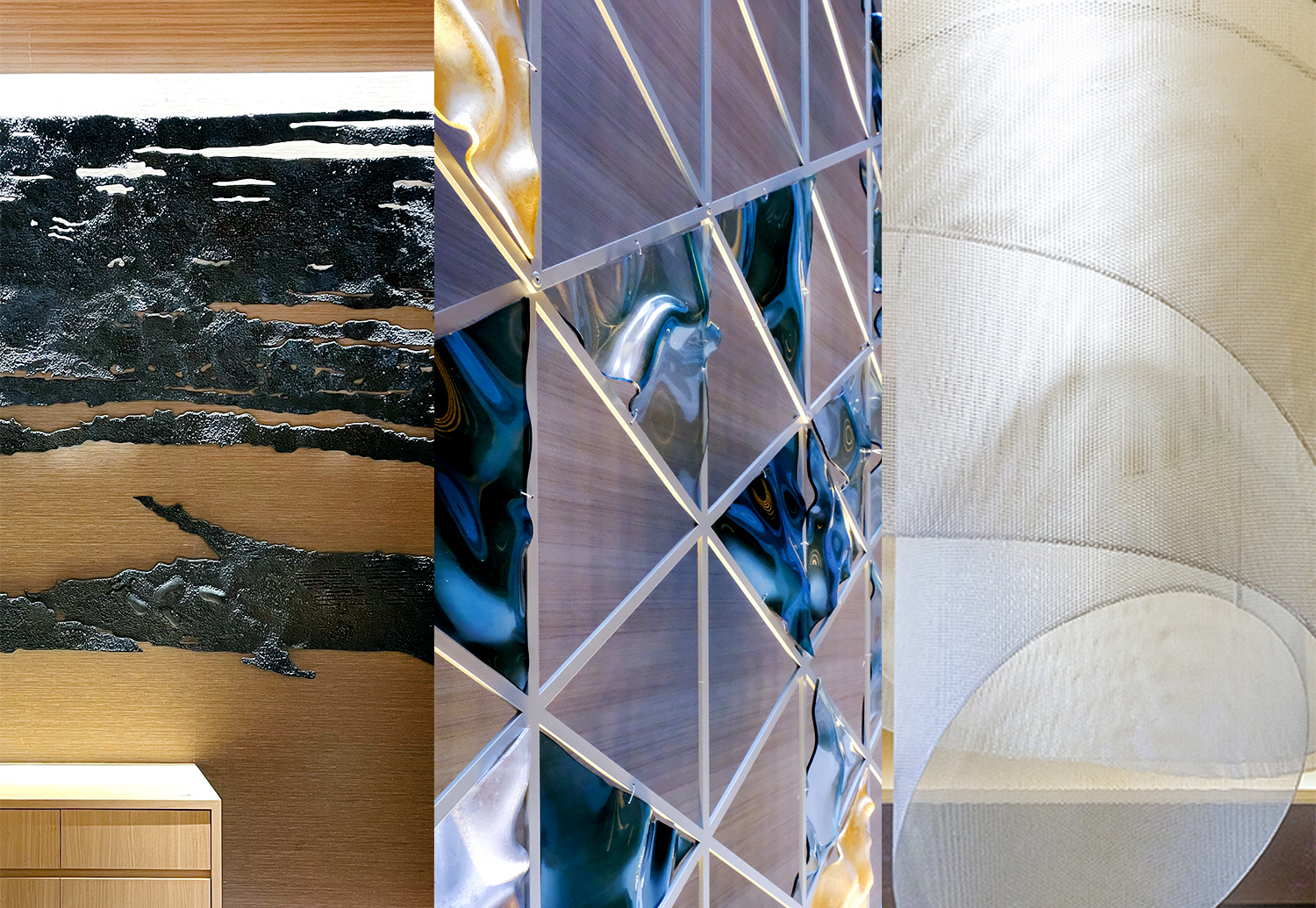
Case 1: Three-dimentional Relief at the Grand Lobby
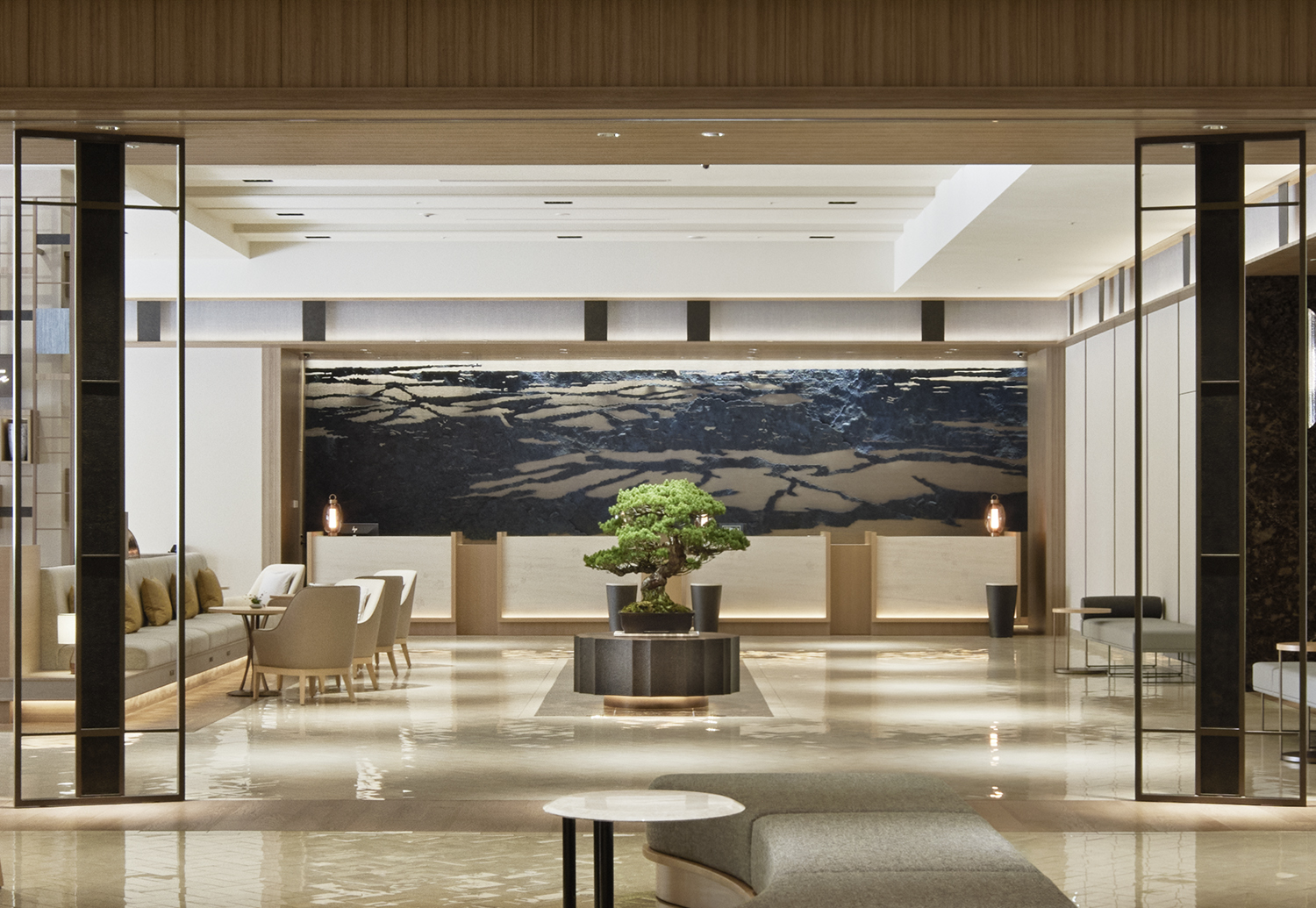
At the main entrance, there is an eye-catching 8-meter-wide three-dimensional relief. From the outset, there was a request for an artwork inspired by the scenery of the Seto Inland Sea, so we transformed the bird’s-eye view of the Seto Inland Sea from Miyajima, the symbolic landscape of the area, into artwork.
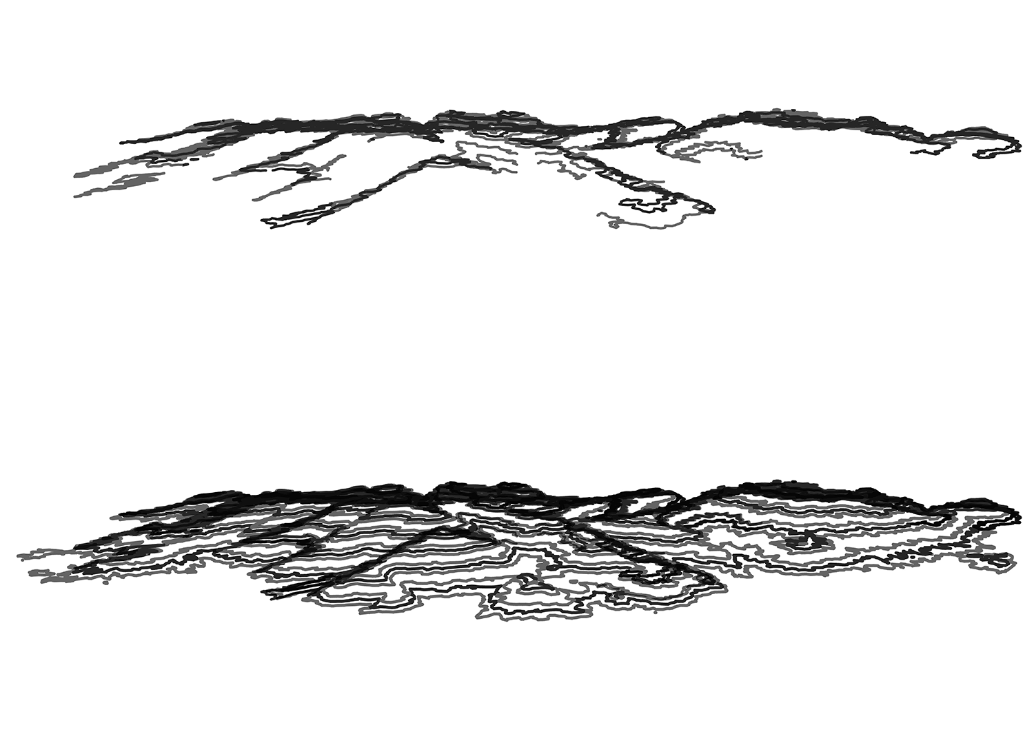
While detailed tracing expresses the surrounding sea, we went through a trial-and-error process to find the best way to represent the islands. The design selected was based on a 3D model of Miyajima, with contour lines created at different intervals and merged into a single piece. The mountains are connected to the sea by the uniqueness of these lines.
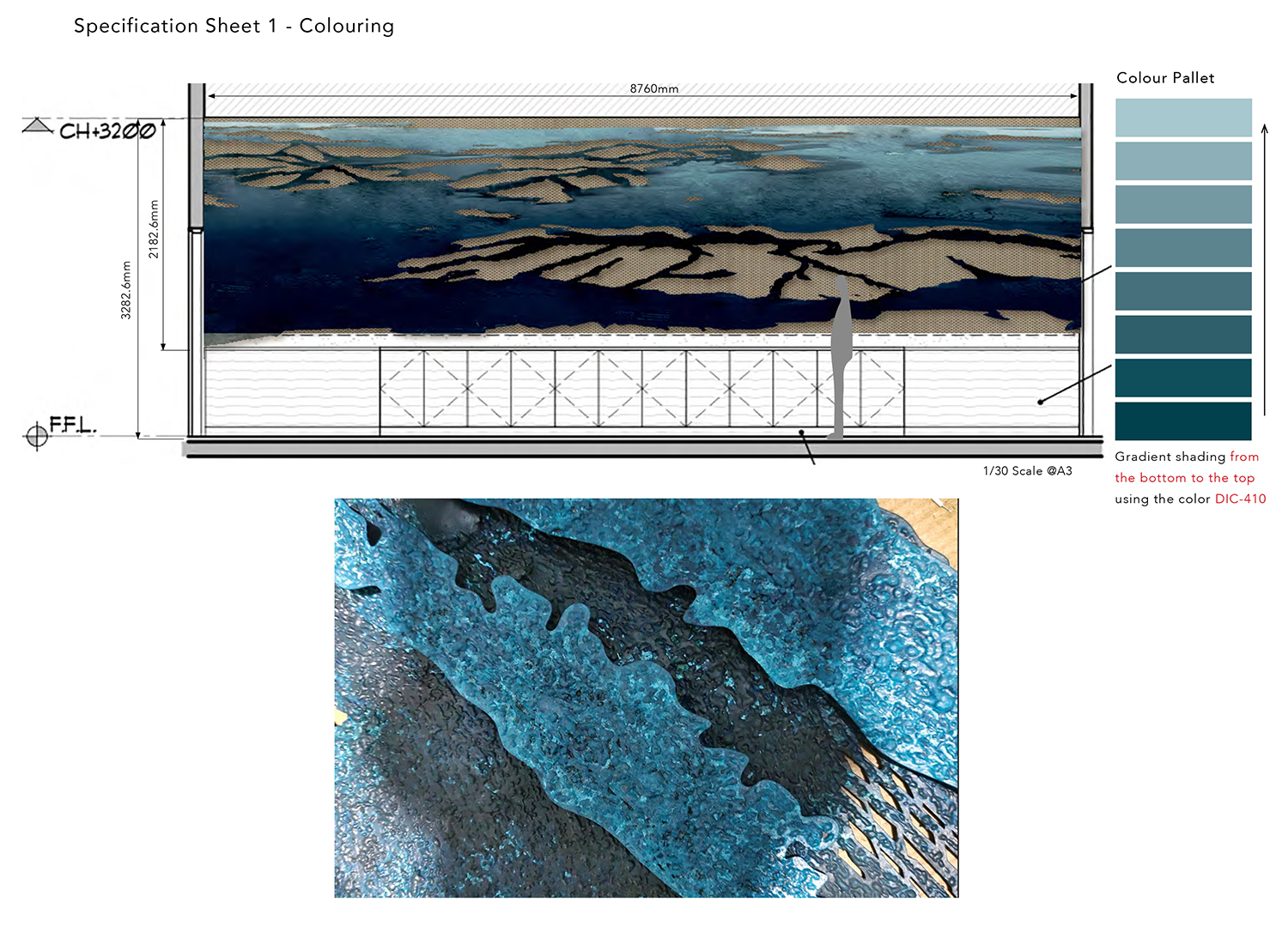
Just as the mountains in the distance appear lighter and the foreground darker, the artwork also has multiple layers to express a landscape with depth. Taking advantage of the unique texture and softness of iron as a material, we attempted to reproduce a texture similar to that of ink in Japanese paintings when seen from a distance.
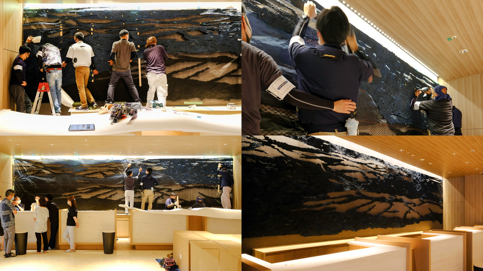
It took six people to lift and install the steel plates, which weighed 350kg. The steel plate has a massive appearance as if carved from a single piece, thanks to the almost invisible dividing lines. Up close, you can see the oyster rafts floating in Hiroshima Bay. The perfect harmony with the bonsai placed in front of it is a lucky coincidence, but we hope you can feel the scenery of the Seto Inland Sea, composed of islands and the sea.
Case 2: The Acrylic Screen Delivered to The Chapel Area
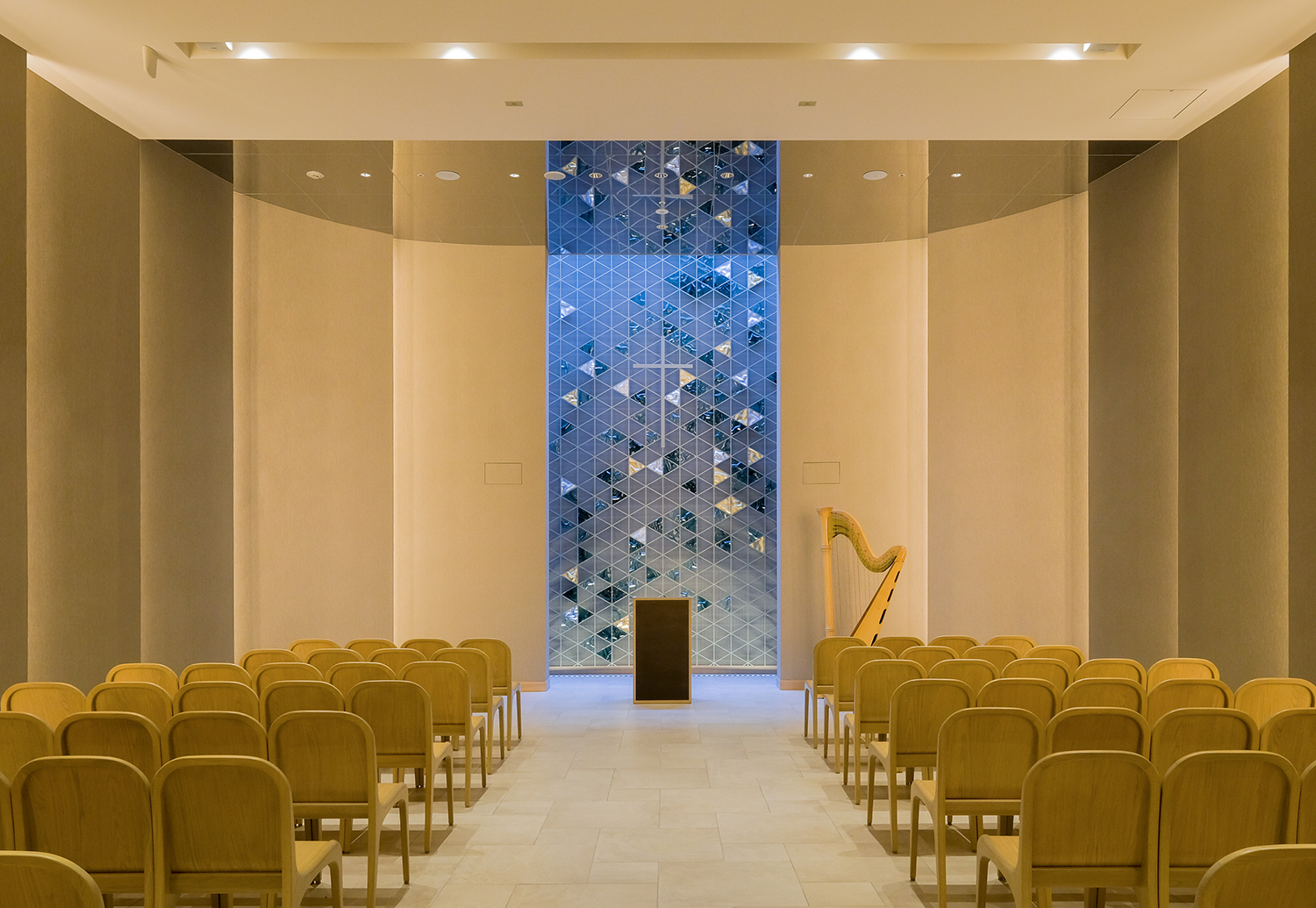
The design concept for the chapel space is “the echoing sound of the koto.” We created a 5.5-meter high screen based on the “hemp-shaped carving” found on the back of the Fukuyama zither, a traditional craft of Hiroshima Prefecture. The work on the back of the Fukuyama zither is not visible from the front, but it is essential to produce better sound and resonance. The story of this artwork is to make that sound resonate throughout the entire space.
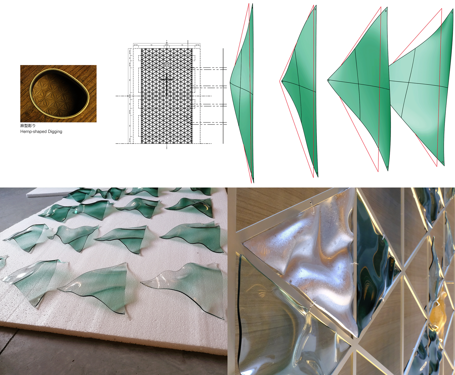
The “hemp-shaped carving” design was simplified and redesigned into a minimalist grid shape to harmonize with the space. We devised the triangular pieces molded into the free thickness and cubic curvature so that the panel appears swaying with sound vibrations. In addition, each of the gold and silver pieces were finished by hand with the help of a local foil stamping company in Hiroshima. With the lighting effect, this traditional craftsmanship shines through its minimalist structure, giving it a sense of depth.
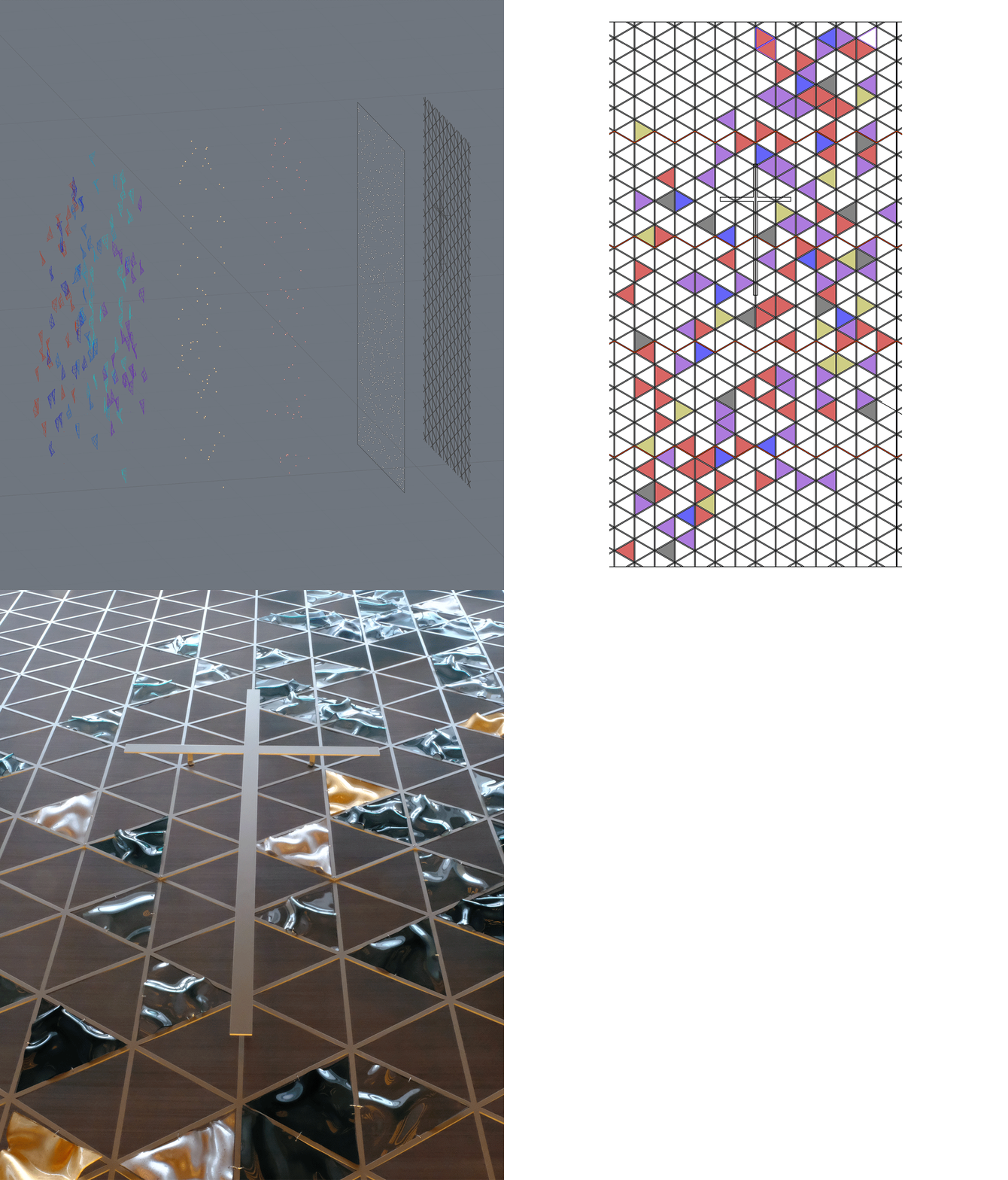
To embody the image of the sound of a koto echoing throughout the space, we aimed to create an installation of approximately 150 acrylic pieces that looked as if they elevated into the sky. Generative design and 3D CAD programming are suitable for randomly selecting, arranging, and coloring 150 out of approximately 600 triangles. To achieve the overall randomness of the composition, we used a programming code called “5 o’clock shadow” or “5 o’clock old man’s beard”.
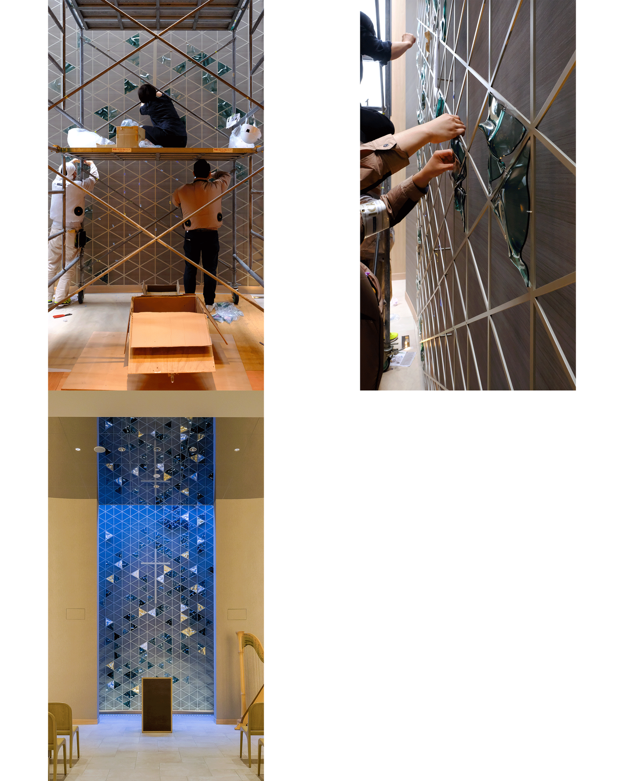
The screen was installed onsite, being wired together one by one to the frame. The ingenious division of the pieces makes it look from a distance as if a single screen of w2900*h5400 is standing up. During the daytime, the acrylic pieces glisten and reflect with the top light from the ceiling, while at night, the traditional foil craft emerges and appears to float, creating an impressive chapel.
Case 3: The Restaurant Ceiling Art
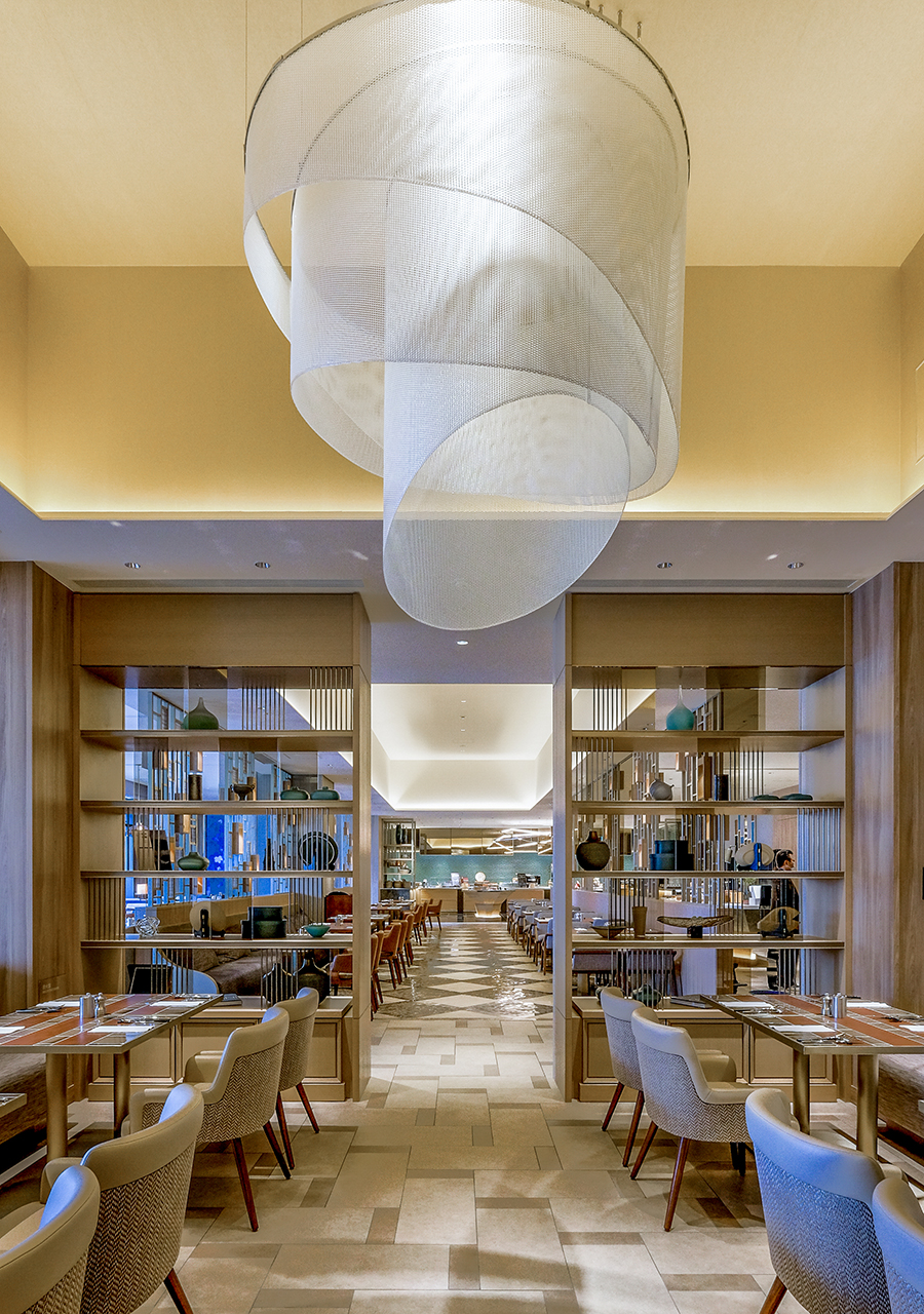
For the ceiling of the restaurant’s seating area, we installed a ceiling artwork that traces the ripples of the Naruto straits and gives the impression of water moving. It consists of high-tech fabric woven in three directions: vertically, horizontally, and diagonally.
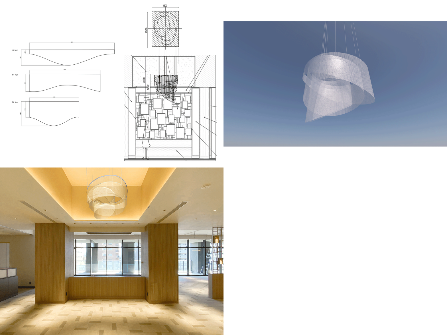
Based on the image of “Uzushio” in the Naruto Straits, three shapes tracing actual ripples were selected and modeled in 3D software. Due to its starring location in front of the restaurant, we opted for a circular shape design, intending to give centrality to the space while at the same time creating a light and comfortable atmosphere.
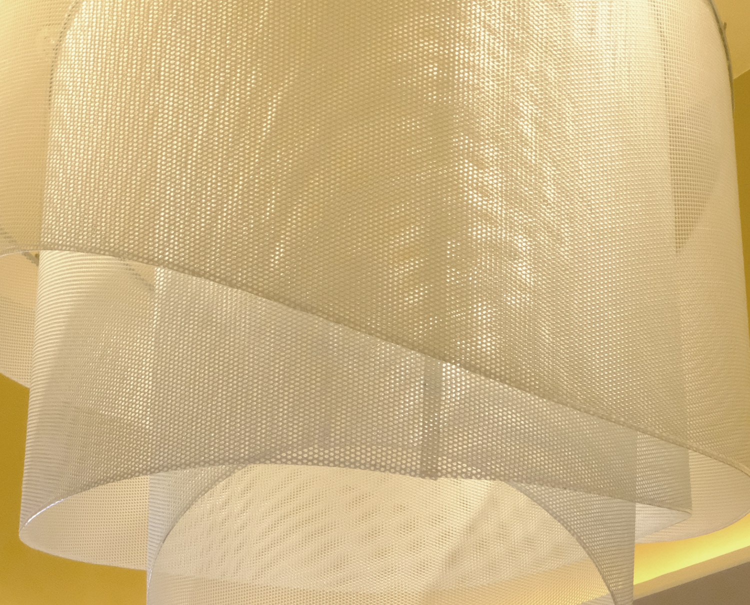
In search of a light and durable material that could create a feeling of looseness, like water bubbles floating, we adopted a new textile material used in F1 and other sports. Whereas woven fabrics’ structure is generally composed of two threads woven in two directions (longitudinal and transverse), this material is woven in three directions (longitudinal, transverse, and diagonal) which reinforces its structure, making it widely used across industries. We adopted this material as it fulfills our design, strength, and weight requirements.
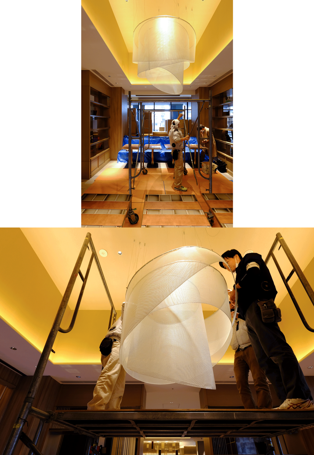
Since we work in various locations across the country, we coordinate with local contractors and construction companies for the on-site installations. Artwork is complete through careful installation.
Projects > Hilton Hiroshima